Works / Brand Identity - Graphic Design

Shake mee
Branding & Store Design
Brief
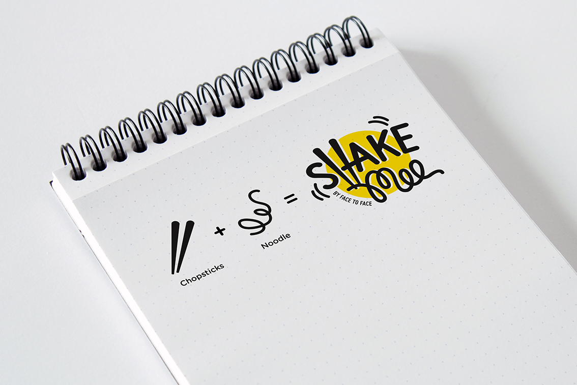
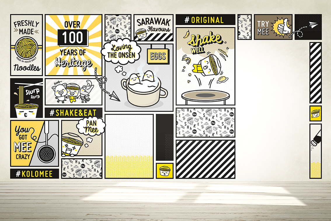
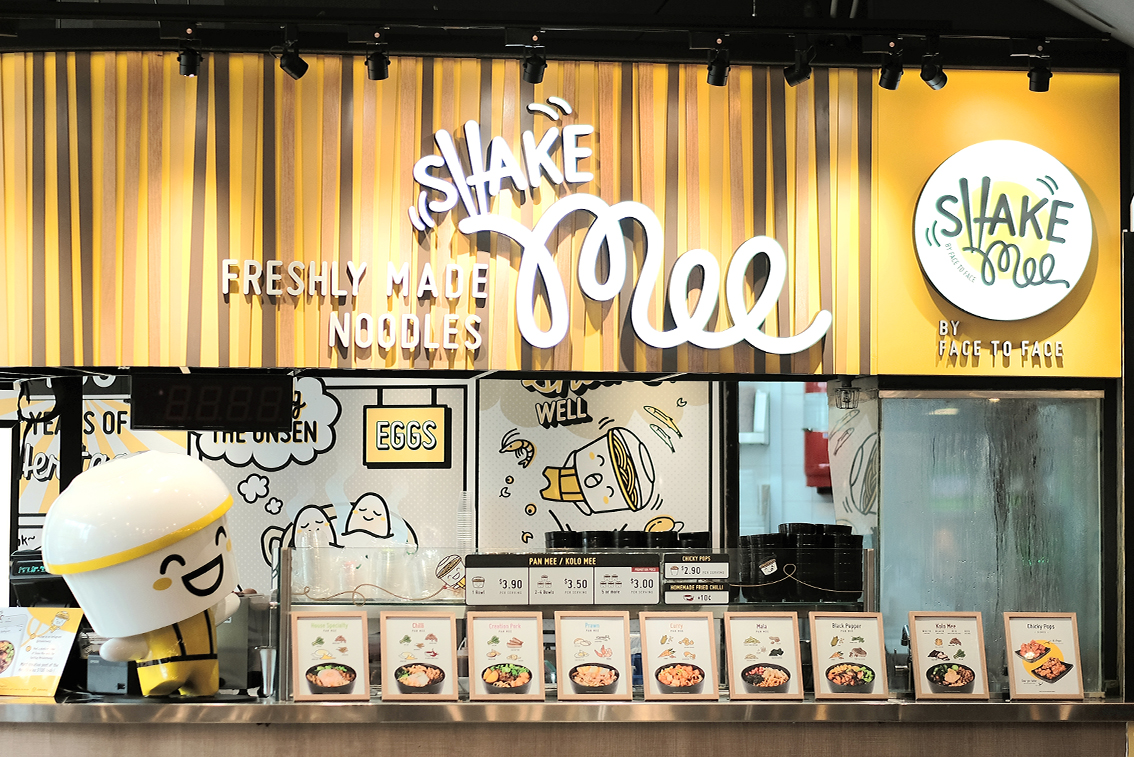
Shake mee is a noodle eatery that is a sister company of the popular eatery Face-to-Face noodle house, which channels a more fun, amusing and bright tone of voice. We were engaged to create a new identity, to introduce their freshly handmade noodles as well as their shake and eat concept to the youth.
Solution
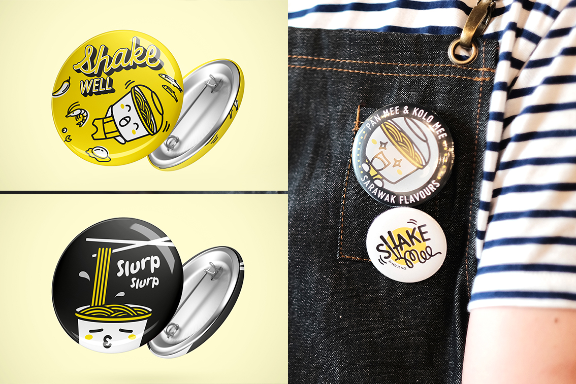
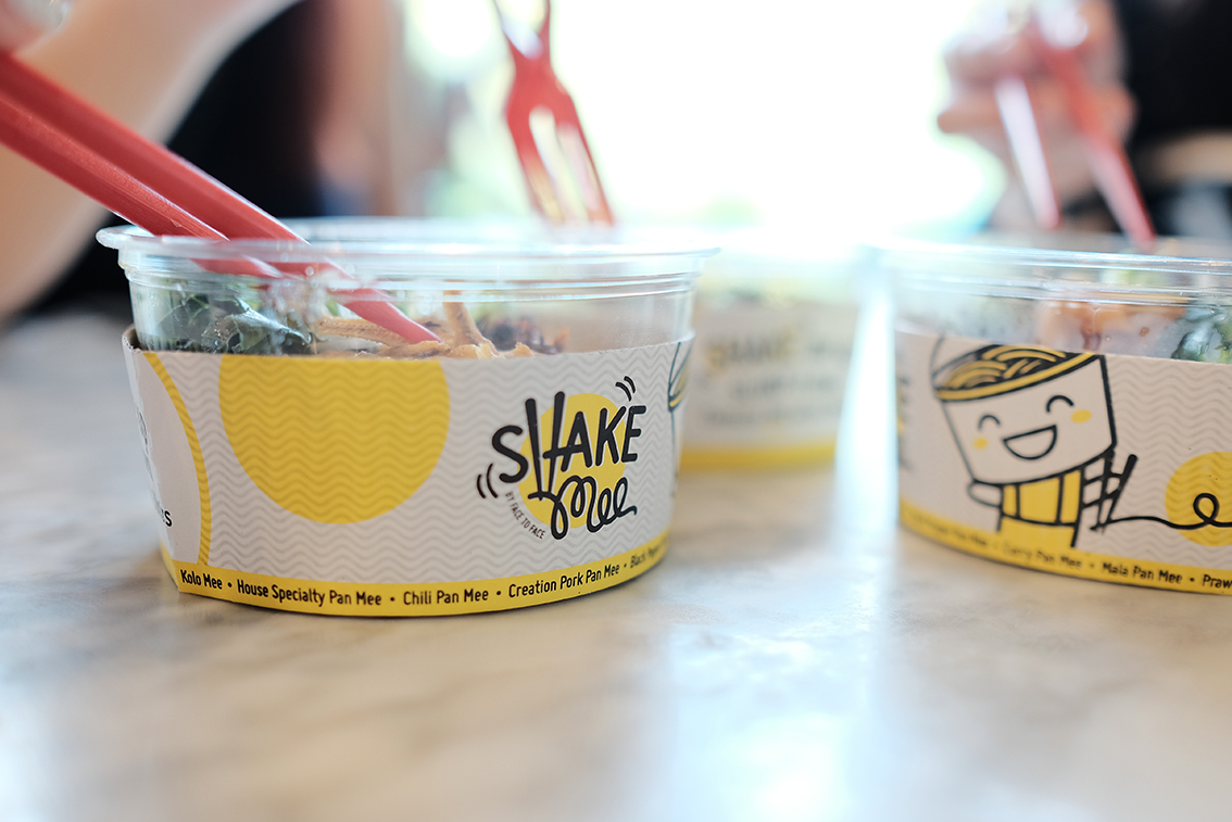
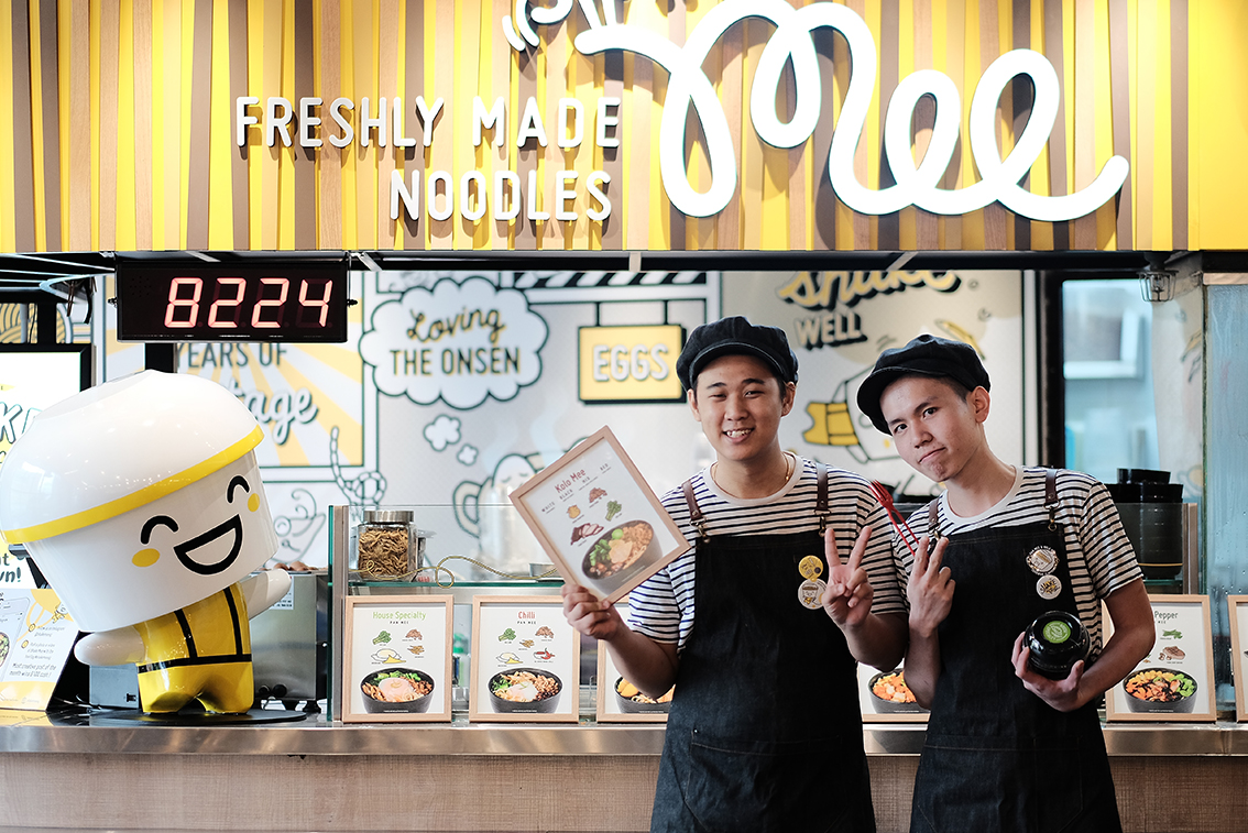
The branding of Shake mee creates an unmistakable look and feel that is fun, personal, and witty. We had created a bright yellow, black and white colour concept that brings out the yellow noodle’s identity. Along with a mascot, we also created murals, menus, packaging and even pins that were used on their aprons. These attention to details helped to enhance and bring out the unique striking personality of Shake mee.